Some chin music with the Filipino artist chosen by the Museum of Avant-garde.
The Harsh noise (HN) genre is one of the bastard children of music and chaos.
It is, as the name suggests, devoid of much tonality or composition, throwing out melody, groove, and conventional song structure, consisting mostly of daubs of sound as a means to expression.
To call it music would be a disservice to musicians and might even be downright insulting to the provocateurs of HN that routinely use computers, synths, mixers, pedals, or even just anything that creates distortion or feedback to craft something abrasive and aggressive.
In fact, most HN is tailor made to sound like a sonic assault. Or as esteemed French noise artist Romain Perrot aka Vomir summed it up: “no ideas, no change, no development, no entertainment, no remorse.”
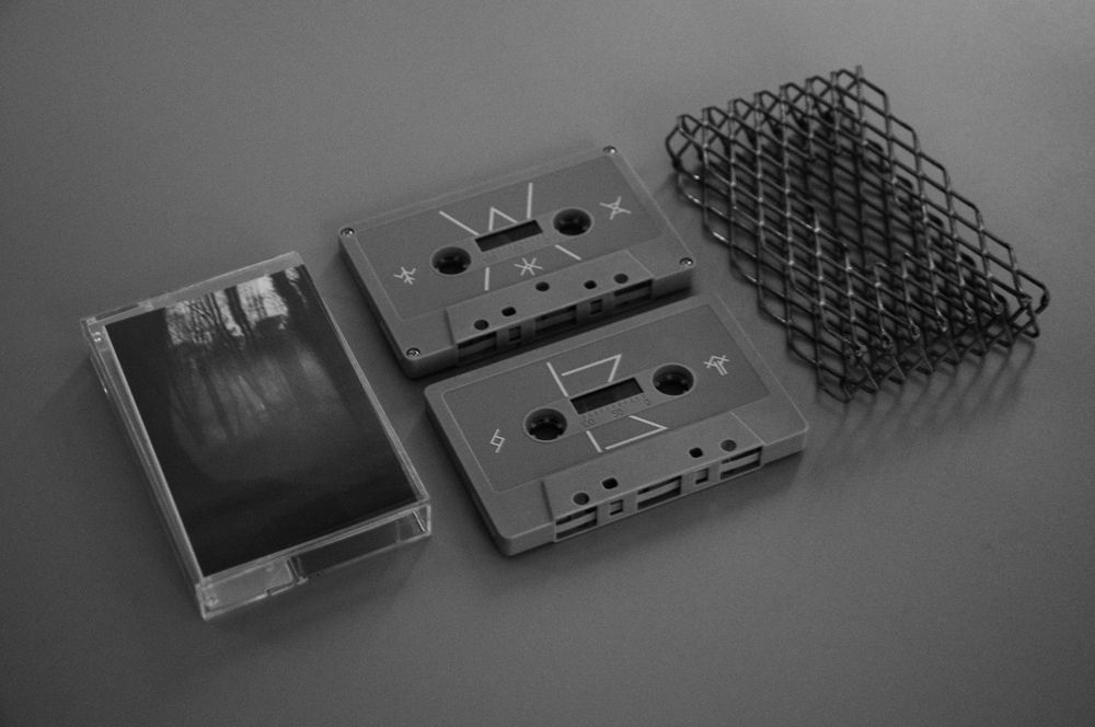
That said, HN and power electronics band White Widow are one of the genre’s more prominent Filipino stalwarts. Last year’s they released “The God Uterus Dissolves,” their latest album under Cebu-based record label Melt Records. Included in the physicals release for the LP was a cassette tape, since analog formats are making a resurgence in recent years. The cassette tape design featured an unconventional and hand-crafted wire mesh case that was as stunning as it was apt for the music inside. It felt uniquely industrial and appeared to at once cage and frame the cover art.
Designed by PJ Ong, the creative director and primary art designer of the Cebuano design studio Inodoro, the cassette has been hailed as a legitimate work of innovation by the prestigious Museum of Avant-garde (MA-g) in Mendrisio, Switzerland.
That makes Ong the first Filipino to be recognized on such an international scale by the Swiss institution in their Graphic Design Category. Behind him are the tall shadows of artists like Pablo Picasso and Marcel Duchamp, whose works are also part of the museum’s permanent collection.
Ong, whose primary listening fare consists of heavy music from Mike Patton and The Melvins, to the metal subgenres of sludge and grindcore, confesses that iterations of the failures leading to the final cassette product was “painstaking to realize with various prototypes.” Still, the successfulness of the final product is a matter of record. And its inclusion in the MA-g was music to his ears.

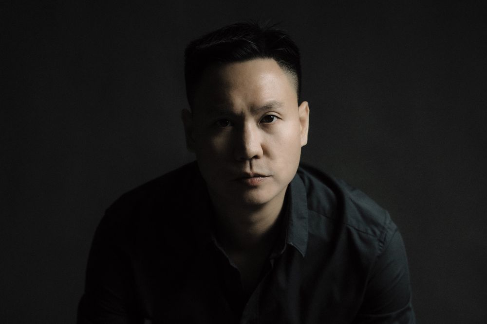
PJ Ong. IMAGE COURTESY OF INODORO DESIGN STUDIO
KARL R. DE MESA: Take us through the aesthetic choices you made for White Widow’s “The God Uterus Dissolves” and the process of birthing it.
PJ ONG: What started out as a casual discussion with White Widow about creating an album in black and white to complement previous releases eventually led to a collector’s piece that revolved around themes of fear, temptation, beauty, despair, feeling trapped and getting lost, with custom symbols representing each track and a mesh encasement that brought the whole narrative together.
White Widow gave me complete creative freedom to design the album, but the grit of the songs and exploring topics such as rune magic with the band fueled the energy and inspiration to curate this limited-edition cassette piece.
KDM: I especially like how the metal grille frames the cover art as if it cages the front.
PO: Yes, the exoskeleton rocks! We were compelled to build an encasement or armor in keeping with some of the emotions within the album; also, to depict protection over the album’s outpouring of vulnerability, as people do in real life.
KDM:What was the process of getting into the Museum of the Avant-garde?
PO: I got an email from Museum of Avant-garde inviting me to submit an art piece that might be a good fit for their platform. They were in the process of gathering work from around the world, with the space set to open in 2025.
They were looking for recent work, and coincidentally, Melt Records had just released White Widow’s “The God Uterus Dissolves.” So, the universe was definitely conspiring!
When I got confirmation that I was going to be part of their permanent collection, it was a surprise for sure; a “Twilight Zone” moment. But, in a really, really good way. Surreal…but nice! Never in my wildest dreams did I expect to hear from a museum. This wasn’t part of the plan; I had a totally different roadmap in mind.
KDM:How’d it feel when you got approval from Switzerland, did it feel like a big win?
PO: When it was acquired for permanent collection I was ecstatic! When I heard that my work would be acquired for MA-g’s contemporary collection, it was music to my ears (pun intended.) It really opened my mind to bigger possibilities, made me realize that graphic design does have its place in the art world. I’m glad I didn’t limit myself and how far I could extend my process.
KDM:Briefly, take us through your history as a pro designer?
PO: Music (in general) made the biggest impact on my journey as a designer. I grew up making my own album covers for mixtapes. Almost every avenue of inspiration stemmed from music, especially from the extreme genres. I have to credit counterculture and certain subcultures as well, including skateboarding and underground filmmaking, which gave me their fair share of creative impact.
KDM:What eventually led you to form Inodoro Design Studios?
PO: With Inodoro, it was a natural (and necessary) progression after I took a short course in Toronto for Computer Graphics, during which I discovered that I had a knack for graphic design. I needed to make it happen! It was a survival thing, and I knew I needed to make something out of it. Although in hindsight, I realize I’ve been drawing since I was a kid, this particular phase brought my artistic inclination back to life and gave it perspective.
KDM: And then came Melt Records.
PO: The makings of Melt Records started in 2017, and being part of Melt was an organic next-step from previous collaborations that I was already doing with [Dexter Sy, co-founder of Melt Records] and his roster of artists. He invited me to partner up and take on the creative side of things.
KDM: Who are the designers in the music industry you admire?
PO: Those would still be the same designers and artists that really made an impact on me from grade school through high school, and beyond. Hipgnosis design group especially Peter “Sleazy” Christopherson (of Throbbing Gristle fame), Peter Saville, Klaus Voorman, v23 (Vaughan Oliver) and of course, undeniably David Carson.
When I started skateboarding and how to do “art”, it would be the metal cover art of Michael Whelan, Pushead and the photography work of Glen E. Friedman.
KDM: What were the difficulties of handcrafting such a tactile “insert” to tape packaging for “God Uterus,” especially in terms of manufacturing?
PO: From sourcing the material, making sure it was rust-proof, to execution by local handcrafters; it was quite a painstaking, but ultimately satisfying process! Quality control was very stringent especially since I had a very specific output in mind—we went through three sets of revisions to get everything right, making sure the fit was perfect and the wire mesh was stable enough to stand on its own. It was an exercise in patience and persistence!
KDM: White Widow is such an excellent but still niche industrial electro noise outfit. What were some of the musical and artistic inspirations you pulled from for the layout, fontography, and palette design?
PO: I think in terms of the overall layout, I took direct inspirations by looking at all of White Widow’s previous releases or body of work, thinking what else they haven’t done in terms of aesthetic and style, while retaining these questions in mind: “What would White Widow’s legacy look like if ever this would be their last album, and how do you elevate the aesthetics and experience packaging-wise?”
Just out of the blue, the answer became clear. I just went with a story-driven, straightforward direction, something sophisticated but in keeping with the same attitude and energy, adapting photography as the main visual medium.
The “metal grille” really came naturally along the process, completing the narrative. How do you design a product with a story, at the same time reflecting its dangerous, scary and abrasive nature physically? This led to the customization of fonts and band logo as I saw W’s and X’s from the wire mesh encasement. Like I said, the answer was just there all along.
KDM: Looking back on your highlight reel as it were, what words of encouragement might you tell your old self back when things were rough, knowing what you know now?
PO: Something I constantly remind myself, “you have to trust the process”. You have to go through all of this to get to where you want to be. You need to discipline yourself. Be honest with yourself. No shortcuts, just one long ride and loads of fun stops. Just enjoy the ride man!
KDM: Any advice to the young folks who look up to you and might one day like to follow on your path of disruption?
PO: Be uncomfortable in your approach to design. You have to constantly remind yourself that in everything that you do, you need to have a healthy attitude of risk taking. In every project, there are always opportunities to look into new approaches and create new possibilities, whatever the medium is.


